
With this ongoing educational blog series, we’re providing freight brokers like you with the tools to increase your productivity and efficiency as you source and manage capacity. If you work on commission, these tips and tricks can even help you increase your earnings.
In this blog, you’ll learn about the Market View tool in Trucker Tools’ Smart Capacity platform. As a freight broker, the Smart Capacity’s Market View can help you negotiate rates, understand historical trends and keep an eye on your competition. Market View provides you with a quick visual of where capacity is available and where it’s tight, as well as insights into how competitive specific markets are.
Accessing Market View
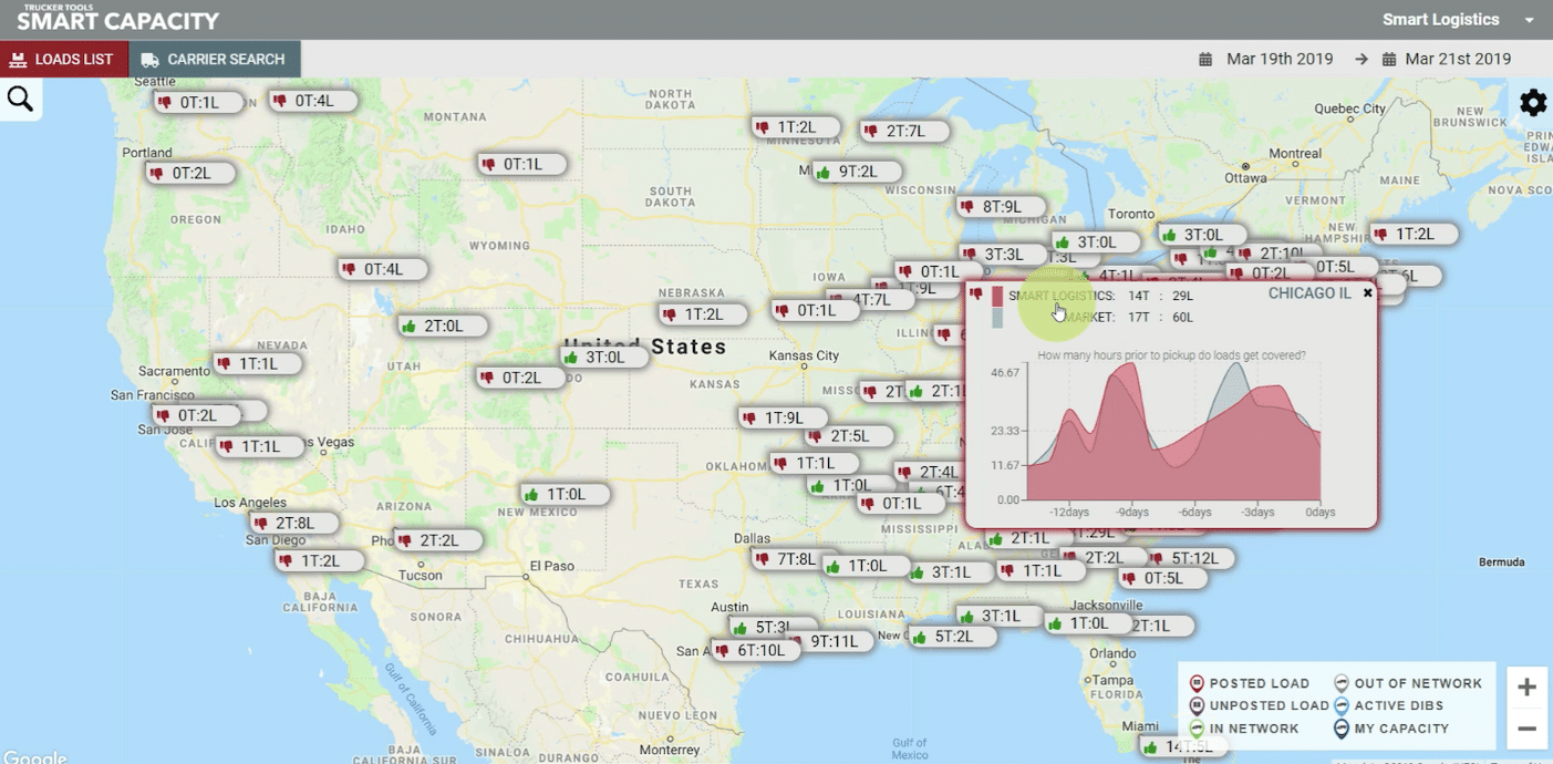
When you open Smart Capacity, the Market View is the first display that you’ll see. Market View shows a geographic map of the United States and provides an easy to understand snapshot view of each market in which you have open shipments or available truck capacity.
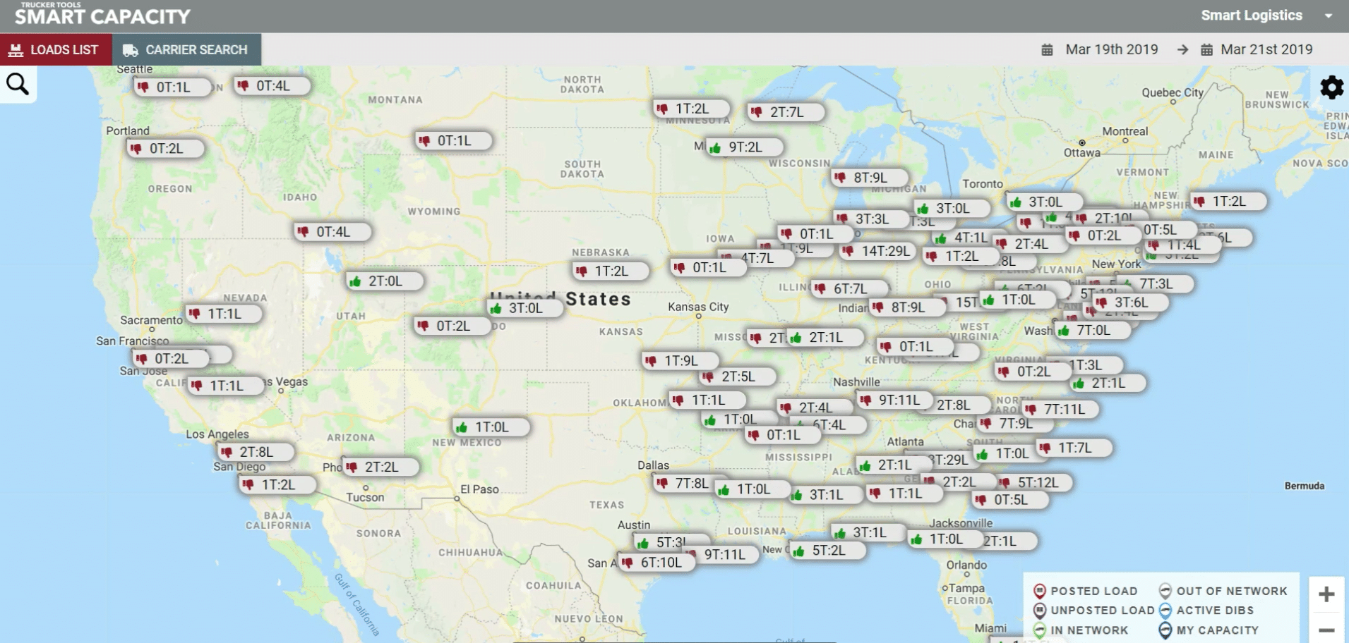
Green Thumbs Up: More Trucks Than Loads
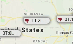
If you see a green thumbs up in the bubble above a market, it indicates a loose capacity market, i.e. there are more trucks than loads in that market. The bubble also will display the truck to load ratio in each area. In the market bubble, T represents trucks and L represents loads. When you see a greens thumbs up, you can interpret that as meaning you have some leeway with carriers when negotiating rates.
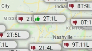
Red Thumbs Down: More Loads Than Trucks
If a market’s bubble includes a red thumbs down, that indicates that the market is tight, i.e. there are more loads than trucks in that particular market. Similar to the green thumbs up, market bubbles with a red thumbs down also will display the truck to load ratio in the region. When you see a red thumbs down, that indicates that you may have to pay a little more than usual to transport freight in this market.
Historical Load Data
To take a deeper dive into a specific market, click on that market’s bubble. Doing so will cause a small window to pop up on your screen that includes a graph of historical data on trucks and loads in that market. The Y axis of the graph represents the number of hours and the X axis represents the number of days it has historically taken to cover a load in this market. The red line in the graph represents your company, while the blue line represents your competitors who use Smart Capacity.
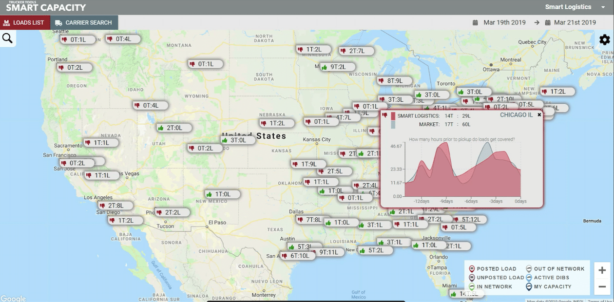
Competitor Data
At the top of the same pop-up window, you’ll see a historical comparison between your company and your competitors in the market who also use Trucker Tools’ Smart Capacity platform. This comparison includes truck to load ratio. In this example, your company (Smart Logistics) has 14 trucks and 29 loads, while your competitors have 17 trucks and 60 loads in this market.
Read the previous blog in this series, “Broker Tip: Use Smart Capacity’s Density Bubbles To Offer Multiple Loads to a Carrier.” Schedule a free demo of Trucker Tools’ Smart Capacity platform for freight brokers and 3PLs.